AI-powered charts, ready in seconds.
Turn CSV, Excel, or SQL data into clean, accurate, and professional visuals instantly.
Like MidJourney for charts, but accurate. With six figures, not six fingers.
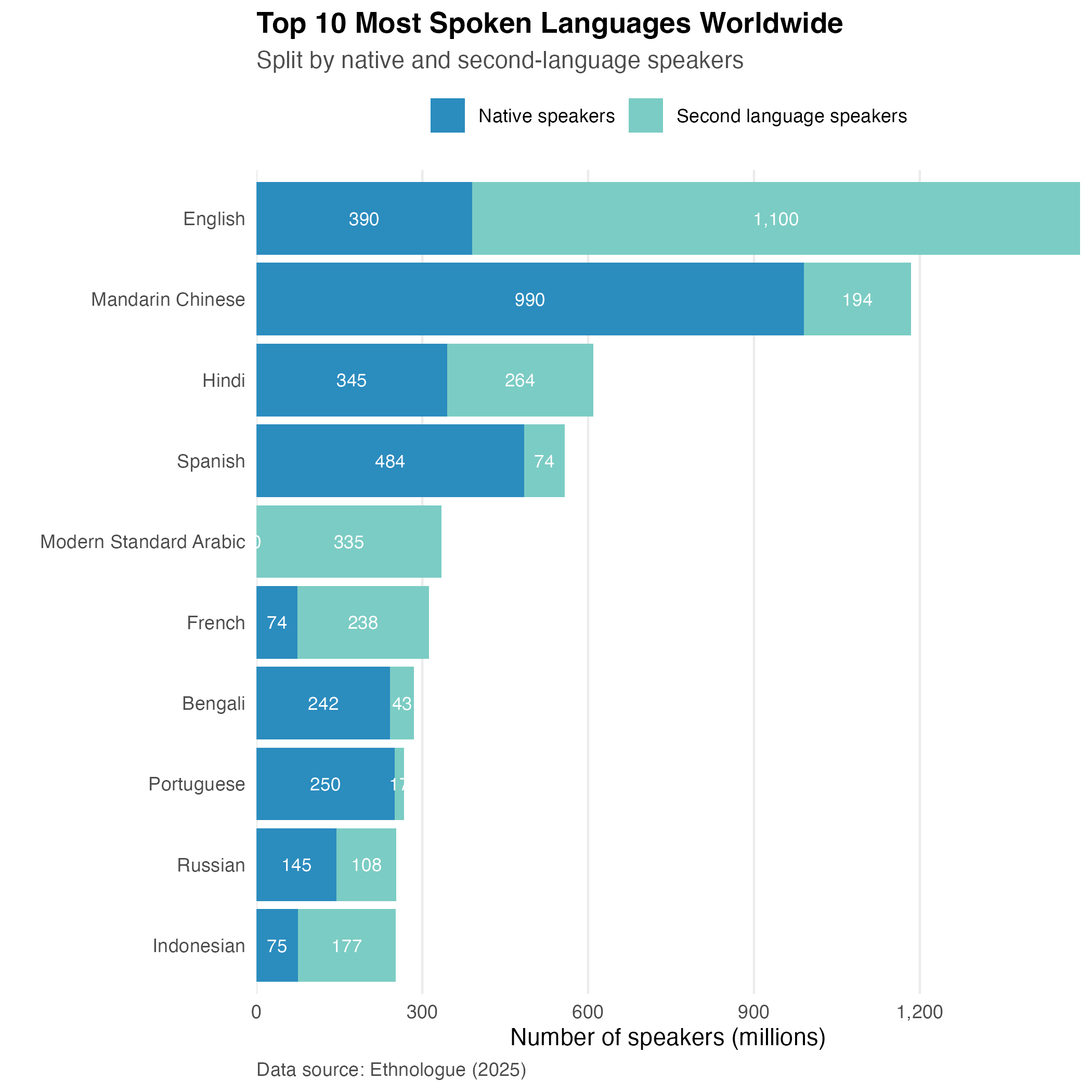
Input: Ethnologue (2025) table from the Wikipedia "List of languages by total number of speakers"
Prompt: "Plot top 10 languages, split by native and second-language speakers."
Input: A dataset with 200k playthroughs of Steam games.
Prompt: "Create a histogram of hours played for each the top 5 games"

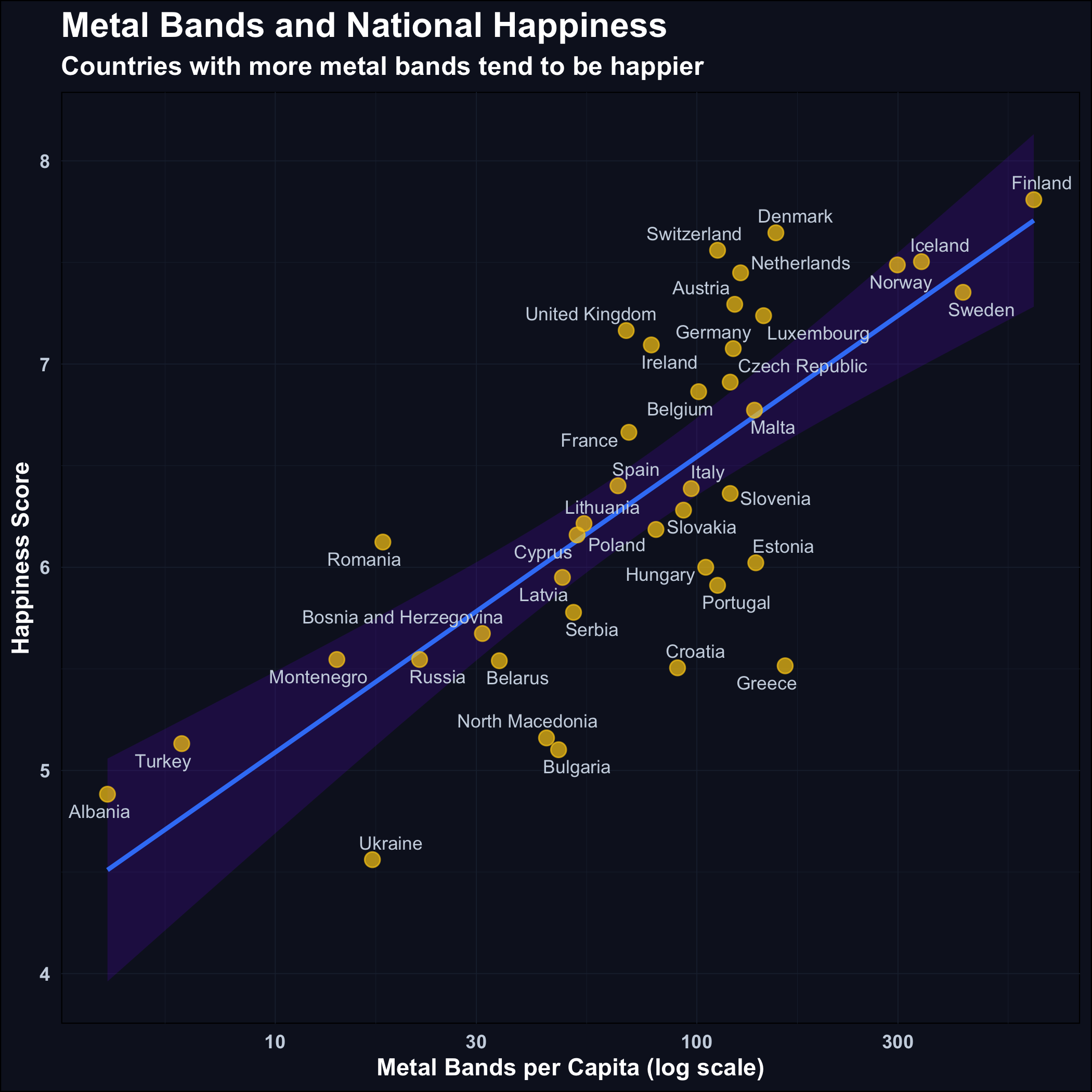
Input: CSV with happiness scores and metal bands per capita data, a screenshot of Quesma website.
Prompt: "Show happiness as a function of metal bands per capita"
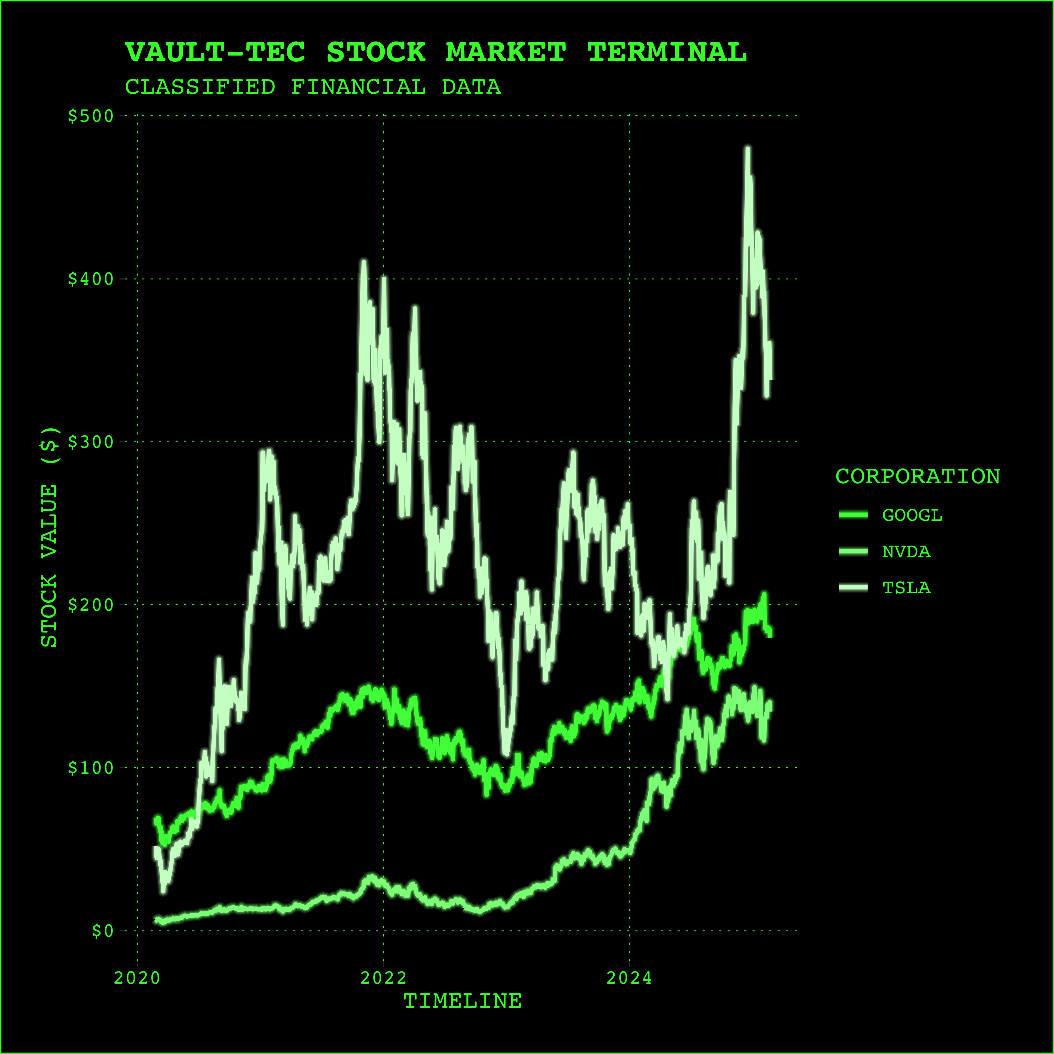
Input: A dataset with five year stock prices for all companies.
Prompt: "Show prices of Nvidia, Google, and Tesla - make it look like from the Fallout game"
Input: A table of 67 talks and a screenshot of the website
Prompt: "Make a bar chart of topics for Data Council 2025 conference"

Easy, Intuitive Workflow
Drop your data
Simply drag & drop your CSV.
Pick your style
Select from built-in styles or let AI match one from an image.
Describe your visual
Write a prompt, e.g., "Show quarterly revenue growth."
Generate instantly
Watch your data become clear, compelling visuals.
Share with ease
Export effortlessly to presentations, blogs, or reports.
Why Great Charts Matter
Effective visuals are crucial in finance, marketing, management, engineering, and science. Data that isn't clearly communicated simply gets overlooked.
High-quality, professional charts elevate your message, creating a strong, positive impression in landing pages, blog posts, academic articles, and presentations.
Expressive and Accurate
We use ggplot2's grammar-of-graphics philosophy, to turn your prompts directly into precise, reliable charting code. Ensuring your visuals are accurate, informative, and visually compelling every time.
Customizable Style
Automatically match your visuals to brand guidelines or publication styles. Achieve consistent, professional results every time.
Use Anywhere
Powered by WebAssembly (WebR), Quesma Charts works completely in-browser, with zero installation. Perfect visuals, anytime, anywhere.
Join us at AI Launchpad @ Data Council 2025
We'll showcase Quesma Charts at AI Launchpad @ Data Council 2025 (22-24 Apr, Oakland, CA). Experience firsthand how AI-driven chart creation can streamline your workflow.
Create Stunning Charts with Simple Prompts
Quesma Charts has now launched in Alpha version. Be among the first to experience precise, AI-powered visuals.
Launch Quesma Charts